January 31, 2009

Notes Violet / HandMadeFont


Lots of cool fonts at HandMadeFont. - Sara

January 29, 2009

Type is Art

site I found where you can play with type characters to create your own work of art. 
fun and educational. 

Gladiator / Marian Bantjes


I love to check out Marian Bantjes' website for hand drawn type inspiration. She's great! - Sara

Made me smile

My friend Nicole sent me this link, and I thought the video was very creative. Perhaps you will smile too.

-Cindy

Vintage Postcards & Letters

I always like being inspired by found objects or vintage items, here are a few images of post cards/letters with interesting type treatments. By the way, there are some really cool books in the library full of images of vintage cards and postcards, which could be inspiring... These pictures were found online. Posted by EMILY.


Trader Joe's, Bag Design

Yesterday I ventured out to the Trader Joe's in St. Louis Park- to the wine section. I thought these wine paper-bags had a nice graphic treatment. Notice the typography inserted into the leaves of the design... (The overall image is a wine bottle filled with this red grape/leaf motif). I thought this was very creative and stylish! Posted by EMILY 


January 28, 2009

Casellart.com


Experimental type poster by Chuck Casella. I love all the different type faces used that still seem to all work together well.

posted by diana

January 27, 2009

Process Type Foundry


Check out www.processtypefoundry.com for some locally made typefaces. Two of the designers are graduates from MCAD. Kinda cool...

Posted by Diana.

January 25, 2009

An nice consideration...

An interesting, potential ransom note, no? It's by Greg Lemarche.

Posted by Neal.
I believe this is by a gent named Dr. D, but correct me if I am wrong. Looks Bansky-ish. 

Posted by Neal.
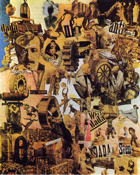
Cut with the Kitchen Knife by the wonderful German Dada artist, Hannah Höch.  1919 C.E.

Posted by Neal.

God save the queen

Original art for the Sex pistols by Jamie Reid

- posted by Neal

Woodtype set


Here is a Flickr set of Rob Roy Kelly's wood type portfolio and wood block collection. Kelly was a wood type specialist who prompted a major typographic revival in the 1970s with his book "American Wood Type, 1828-1900: Notes on the Evolution of Decorated and Large Types and Comments on Related Trades of the Period."

- Erik

Typolution


Here is an interesting type-animation video via youtube. It seems likely it was made with After Effects, too.

- Erik

January 23, 2009

Found this fun Type Matching game a while back. I'm Helvetica!
-Julianna

Ransom Notes Generator

I found this while researching ransom note ideas. There's a lot of bad ones out there but I thought this one was kind of cool. I like how it doesn't just use the type but also the backgrounds to create the word.

http://blogoscoped.com/letters/

-posted by Heather

January 22, 2009

Print Gocco??

Ok, last semester I heard Zach Keenan mention this contraption called a Gocco, I recently read about it again in ReadyMade magazine and thought I would look it up see what its about. I found this article: www.diylife.com/2007/12/14/diy-definitions-print-gocco/  It talks about what you can do with the machine (basically tabletop screenprinting), different types of machines and so on. -Nicole
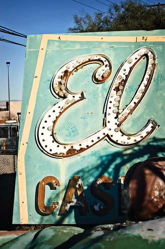
I really enjoyed this photoset on flickr of The Boneyard, a collection of classic Vegas casino signs. I thought it has some really cool examples of vintage type.
-julianna

Business Card / Pierre Vielcazat


Business card design by Pierre Vielcazat.

Love Sentence / Emily CM Anderson


Book design by Emily CM Anderson.

January 21, 2009


Here's a poster I found by Scott Hansen at http://www.iso50.com/iso50.html.
-John

www.matthewcroft.co.uk


specific and calculated method for creating type...phaydara

Kate Gibb @ bigavtive.com


Here are book covers designed by Kate Gibb of BigActive Design.
Check out bigactive.com, they work in a variety of design areas. I love Kate Gibb, she uses lots of layers and images in a way that feels energetic without being chaotic or messy. I like how the hand drawn words meld into this piece especially. -Nicole

thesmallstakes.com


band poster for dodos...

another band poster for why? both very simple technically but also very effective...phaydara

Arm


Here is another 3D image drawn with type. It is from DryBones90: http://drybones90.deviantart.com/art/white-hand-type-75793806
-Kirstin

Aesthetic Apparatus


Here are a couple of posters from Aesthetic Apparatus (http://www.aestheticapparatus.com), they have a lot of interesting work on their site incorporating band names with found images.
- Kirstin

Zebra

Here is another image that uses type to create a 3-dimensional looking image. I think it's amazing how the artist created so many different planes with type. It was posted by "fuzzyzebra" at deviantart.com.

-diana

Typotecture


Here is a Flickr set I stumbled upon that highlights posters from an exhibition that uses typography as architectural imagery.
-Erik 

Logos that work?

If you follow the following (20 "weird" logos...), you will find interesting logo designs, many of which use typography in innovative ways. The logo above, is one of my favorites from the list.
- Erik

January 20, 2009


This poster was designed by Marian Bantjes for the design unit within the Academy for Educational Development. It says "Design Ignites Change" and is part of a series of posters that they do to promote the importance of design in development work. This version of the poster has no printing, but is cut from white paper. I liked how the poster interacts with any environment it's put in. -Ashley


website page from designer Ed Fella's site
www.edfella.com
I like how he combines traditional techniques into modern ways. -Ashley

Inauguration Invitation


I thought this was only fitting for today... the invitation for the presidential inauguration. It was created by Precise Continental, a printing company in Brooklyn, NY, and the type used is a customized Shelley Allegro. A million copies were printed and it was specially requested that everything was FSC certified (more green-friendly)

posted by Diana

I love typography!


I found this blog over break and really enjoyed looked at the articles and images. Its very inspiring! Their last post included this poster from Mike Harpin:


- Posted by Heather

Design Inspiration


This typeface was designed to reflect the language of an indigenous people. That is an amazing concept to me. How does one begin this process? Cindy
Here's a poster for James Brown I found at GigPosters.com. It's done by a designer called Moctezuma, but I wasn't able to find anything else about him/her except an email address. I love how almost all of the image is created by text. There's a ton of other band posters at the site if you check it out

-John

Dangerous


Here is a T-Shirt Design I found on Threadless.com, "Dangerous." This was done by a designer named "Draco." Unfortunately, his website doesn't show any additional work or information, so I'm not going to list it. I think it's cool how the snake forms the word! Threadless recently held a design competition for creative typography, and the winner should be announced shortly, so that might be something neat to check out in the near future. Visit: www.Threadless.com

Posted by: Emily


Illustrator and Photoshop Shortcuts

Not quite type related, but I stumbled upon this web design blog while inspiration shopping, and I thought the two posts of Photoshop and Illustrator shortcuts were useful. Especially since a lot of them are not in any of the menus or anything.

Photoshop

Illustrator


-julianna.

Job Resources

Since so many mentioned looking for a job tonight, I thought I'd post this link to a site I belong to where they have a job board and a GD group. Also, a classmate of mine will be sending me some links for suggested organizations to join that may help you network. As soon as I get that list, I will happily share it here. Cindy

Piet Zwart

Piet Zwart (1885-1977), Dutch photographer, typographer, and industrial designer. Of the De Stijl period, he uses "principles of constructivism" in his work, bold, sans-serif type, primary colors, geometrical shapes, and repeated word patterns... Most of his work (275 designs) were for the Dutch Postal Telegraph and Telephone Company (NKF). 

January 18, 2009

"Scarlet Letter" by Doug Wilson at Keep Calm - letterpress poster.

posted by neal

Number One.

hello. welcome to the spring 2009 semester! 
for the next 4 months we will be focusing intently on all things typographic.
stay tuned for mind blowing inspiration.

[*this post was written in compliance with the cult of the lowercase]