July 28, 2010

Bad Poster with FEZ


I was looking over what everyone posed last week and I realized that mine was not on there. Maybe it didn't work, but here is an example of a bad poster.

Does the guy on the right look like Fez from "That '70's Show"?

CD Designs


Be CAREFUL when designing the face of the CD!


I thought this was a unique way to display the album title


Everyone knows this CD Design
Posted by Kelly


What Graphic Designers do by Ellen Lupton

"Designers get paid to negotiate the difficult terrain of individual egos, expectations, tastes, and aspirations of various individuals in an organization or corporation, against business needs, and constraints of the marketplace... Getting a large, diverse group of people to agree on a single new methodology for all of their corporate communications means the designer has to be a strategist, psychiatrist, diplomat, showman, and even a Svengali. The complicated process is worth money. That's what clients pay for."

Posted by Neal.

Album covers I like :)


by Megan Leffler

trippy album covers


Paramour - Riot! -- I like this one because of the use of text and color to move you back and forth and it totally feels like a chaotic riot.


Traffic - Low Spark of High Heeled Boys -- never heard of this band or album, but totally dig the 3-D aspect of it.


Weird Al Yankovic - Off the Deep End -- I have to slip some WAY into this one... This is one of my fave albums, and the parody of the Nirvana album cover with the baby going after the money is epic.


Lifehouse - Smoke&Mirrors -- I went and saw them in concert with Daughtry a while back and their back drop was a huge mock up of this with the reflection of the smoke (you can kinda see it on the cover)


Animal Collective - Merriweather Post Pavillion -- Never heard of this group or album before, but it was waaaay too trippy NOT to include this....all optical illusion...
amanda.nerud

Some favorites


Counting Crows debut album (and my all-time favorite), August and Everything After


Cover of Van Morrison's single, "Bright Side of the Road"


I don't own this album, but their new song, "Stop for a Minute" gets stuck in my head all the time! And I thought this cover was really cool and fitting of the album title.


Posted by: Hannah

July 21, 2010

welcome to the crash arcadium


posted by erin e. gerrits

Overly cluttered messes

It was really hard to look for bad posters, my eyes kept going to the well done ones that I liked! But here are a couple that just have WAY too much going on for my taste.


Posted by: Hannah


yeah, not so great...

so for as much as you hear about 'bad posters' they're actually kinda hard to find... these are the two I could find...

You can't really see what's written because it's blue on black and different various blacks...
this one, while simple, is kind of confusing. it's about pollution, but that soil looks pretty nice, and although there's nothing but dirt for a few miles, this could be a freshly tilled farmstead and a pesky little weed...not pollution....
--Amanda Nerud

July 19, 2010

prevent..... this.


posted by erin e. gerrits

July 14, 2010

Touching - shows emotion
I really like this poster! Cool idea!

posted by kelly

FLUGTAG

Typography:
When I was designing brochures I found this helpful-

19 Fonts in 19 Combinations

I saw this on the wall in the Saint Paul skyway and though it is not a poster I have to commend Red Bull for thinking outside of the box (literally). Sorry for the poor quality image I have yet to upgrade to the new iPhone...


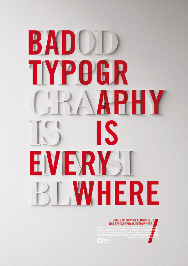
Now for some posters with awesome typography...


by : Megan Leffler

July 13, 2010

not yur average lolcatz....

WHILE I LOVE me some lolcatz, I'll refrain from actually including them in my post...while some are quite good, some are just ridiculous....these are better...


the type is fun on this one...gives it more than if you just wrote it plainly.


This one I thought was really cool. I was upset I couldn't find a bigger one to see more of the facts. But it's about gun deaths.


I thought this one was cute...but if you're not 'in' with the Apple lingo, you may not fully understand this till someone explains it to you, and then it may not be as funny as it would be otherwise...

But I suppose most designers are the Apple 'in crowd'....


From a design standpoint, very neato. Crank is the movie name, it's the sequel-- so two fingers up--arching the 'energy'....simple. creative. gets the point across quick.


This one was fun too, but-- like the gun/skull design-- has a message...


amanda nerud haz scoured teh interwebz fur dese..fur yur bettermints...

Obama and Trees


The famous Obama posters... very patriotic


Came across this in my research on "urban forests" if it hadn't been done already, it would have been a great idea for my own poster!
Posted by Hannah

July 11, 2010

would this be a good iKea here?


posted by erin e. gerrits

July 7, 2010

Typefaces


Typical Typefaces


Posted by: Kelly

type and design

two similar ideas with circular type...


And then three neato quotes made into appealing posters...


courtesy of a. nerud

July 6, 2010

Typography in 3D


I'm pretty impressed with myself for figuring out how to post a video on here :)
Cool video full of typography for Lexus's hybrid that I stumbled upon while reading many, many, healthcare marketing blogs (in case you were wondering).


So true...


Posted by: Hannah

July 5, 2010

true love of type

one of my favorite wedding invites.... their story is told through type only. (vs pics, too) so cool.


posted by erin e. gerrits