Showing posts with label Maps. Show all posts

November 10, 2010

Map: Wikipedia Debates


Infographic for Wikipedia's publicly updated subjects. Some of the lamest examples of editing that has gone back and forth on Wikipedia. Pertaining to religion, ethics, culture, technical and even spelling. Size of the box relates to how big of an issue it was. See it larger on Information is Beautiful

Posted by Anne Ulku

Self-Description vs. Redundancy

This series of graphs from Randall Munroe's xkcd is entirely self-descriptive. As the mouseover text on the original image says: "The contents of any one panel are dependent on the contents of every panel including itself. The graph of panel dependencies is complete and bidirectional, and each node has a loop." That is, if you decide that you want to change the size of the black pie slice in the first panel, you then have to change the height of the first bar in the second panel (which changes the height of the second bar), and then change sub-panels 1, 2, and 3 in the third panel (indefinitely changing the sub-sub-sub-etc. third panel). What I love about this is how it's such a complex intra-active system without relating any useful information to the viewer. The workings of this map (or comic, or graph, or drawing) are entirely internal.

What makes this funny to me is how Munroe uses the traditional language of visual information (i.e. maps , charts, graphs) to present something inward-looking, and really, pretty useless. It's not a wolf in sheep's clothing -- it's existentialism in sheep's clothing (interesting to think about, very abstract, and not at all directly relevant to your life). But he's not trying to trick the viewer into thinking that it's anything more than that. A cursory glance may make you think there's something more going on here, but read the text and you'll see that all the things this map refers to are located within the map itself.

The great-great-great-ancestor of this map could be Magritte's "The Treachery of Images."

It's not a pipe, but it looks like one. The original image is a painting of a pipe, which you can't smoke with. Similarly, Randall Munroe's map is not a map -- it's a map of a map. Or does that make it a map? You can make a map of a thing, but you can't make a pipe of a thing (apples notwithstanding). Maps, drawings, paintings, charts, and graphs are all forms of visual representation, and yet visual objects themselves, which makes it tricky to deal with when an object visually represents itself.

I forgot what I was talking about!

Posted by Scott

Evolution of Nokia phones

I thought this was kind of a cool visual representation of how a certain kind of technology has evolved over time.

Not that clever as far as maps go, I suppose, but still interesting.

Posted by Dave

November 3, 2010

The Seven Bridges of Königsberg

In the city of Königsberg, Germany, there is a part of the city surrounded by a river, which flows away in three directions. There are seven bridges in the city. Here, use this image as a reference:


Euler, a mathematician, posed the following problem: is it possible to navigate a path through the city crossing each of these bridges once and only once? Assume you're not allowed to cross the river unless it is via one of the bridges above. Spoiler: you can't do it. There's a proof of why that I used to know several years ago, as a young man growing up on the mean streets of Milwaukee, but those days are over. Now I'm more interested in this problem's taking a very geographically-based network and removing it from geography.


This is the same map as above, only with all geographic references taken out. You can't see your house from here, but you sure can try to find a path across the bridges. Here the yellow dots represent regions of the city, and the lines connecting the dots represent paths across bridges. I'm interested in doing something similar on a large scale, say, the US Interstate System. We'll talk in class! I'll probably repeat exactly what I say here because we're just going to look at the pictures! Excellent!

Posted by Scott.

Map: Flavor


Mapping flavor-- or also known as a Carbon Foodprint.

The flavors of food are not unique per product--it is the right combination of flavor molecules that make each product have its particular taste. That means, each product can be easily replaced by a combination of other items.

This chart shows the flavor of an orange.

There are ten key flavors to combine that are needed to recreate the orange flavor. Each color in the chart represents a key component with its flavor named per category- i.e. herbaceous woody, green, floral citrus, etc.

To obtain the flavor of an orange, you must take one component from each color category. The length of the line in the graph represents the amount of that flavor. The longer the line, the more you will need.

Posted by Anne Ulku

October 27, 2010

The Family Tree

Which came first, the idea of displaying genealogy as linking familial relations from top to bottom chronologically, or the term 'family tree'?
Here's a pretty typical family tree, comprising what looks to be around 9 generations. The farthest back in history is at the top-most part of the 'tree,' and the most recent at the bottom. Weirdly, this is completely inverse from how trees actually grow (you know, from the ground up), but the analogy has stuck so well that it's very easy to find 'family trees' that are stylized to resemble physical trees.

This one's a pretty lazy example, with the 'family tree' being superimposed onto an illustration of a tree. Poor Scotty must have been kicked out of the family or something.

This one's great for a number of reasons. The entities represented are actually connected via branches that wind around each other to signify familial relations, and the creator realized the backward nature of the 'family tree,' choosing to instead build it from the ground up. You can see Donald Duck in the second row from the top (second-to-youngest generation), third from the left. There's a nice depiction of different families that Donald's lineage stems from by means of separate trees, the branches of which get jumbled together. In addition, the fact that we skip a few generations going from Pintail Duck (bottom, middle tree) to Humperdinck Duck is shown by the branch momentarily disappearing behind leaves: that chapter of history is obscured to us.

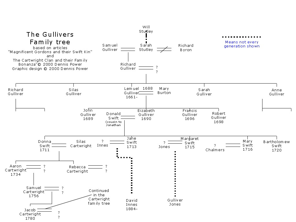
Family trees are a way of tracking relations between members of one or many families, but once you go enough generations back, or enough cousins sideways, it becomes increasingly difficult to accurately, visually portray the information. For instance, it's likely (though I'm sure you don't want to hear it), that your biological parents (or you and your partner), have a common ancestor within written history. Super-likely if you and your partner have the same ethnic and cultural background. For the family tree, this means that a 'branch' would split (via children, grandchildren, etc.) and eventually rejoin. Visually, this would mean 'branches' crossing over each other.

Is it possible to create an organized family tree that includes dozens of generations and thousands of people, given the super-prevalence of incest?

Is a tree the best visual metaphor we can come up with?

How would a family tree of families be depicted visually? That is, instead of representing individuals, representing families (and how do you begin to define that?)

Posted by Scott.

October 26, 2010

Scott McCloud, Linux, and e. coli


Scott's Chris Ware post from last week got me thinking about comics as maps. I was reminded of the work of Scott McCloud, a graphic novelist in his own right, but better known for his critical, academic writings about the medium of comics. The "map" (I suppose technically it is more of a chart, but that's a kind of map, right?) at left moves from abstraction to representation along the vertical axis and from drawings to words along the horizontal. Taken together, it is a pretty awesome representation of the vocabulary, grammar, and meaning available not just to comics artists, but to any visual artist.

The second map compares the Linux OS with e. coli bacteria. I don't fully understand this, but I think it is fascinating.


Both of these maps came from http://blog.visualmotive.com/

Posted by Dave

October 25, 2010

Map: Marian Bantjes' Influences

Marian Bantjes- an elite artist, designer, typographer, illustrator and writer- has mapped out her obsessions, travels, personal artistic influences, themes, working materials, styles of work, etc. A visual representation, and work of art, that truly represents who she is as an individual. (Map dated from August 2006)


See it on her website: Influence Map

Posted by Anne Ulku

Populations as 3D Spikes


Two maps that represent populations as 3D spikes. Pleasing to the eye, no?


Posted by Lisa.

October 19, 2010

Chris Ware's Maps

The climax of Chris Ware's 2000 graphic novel Jimmy Corrigan: The Smartest Kid on Earth traces the genealogy of Jimmy's adopted sister Amy to the late 1800s, revealing that Jimmy and Amy are actually related. Using symbols and images rather than text, Ware creates a map for the reader to follow, with one scene leading to another chronologically but branching out thematically, calling out motifs in the novel and representing characters with just enough marks for them to be recognizable and unique. The map in Jimmy Corrigan is one of specific people and relationships, representing on a larger scale the changing social landscape of 20th century mid-America.

As a comic artist, Chris Ware's entire body of work could be consider maps: they represent (people, places, ideas). Some are more literal than others, like his (rejected) Fortune magazine cover:
Visually and with text ("Toxic Asset Acres," "Fábrica de Exploitación"), Ware's map of America attacks the magazine and its values at the height of the Recession. Another map (from Building Stories) charts the changing occupants of an unchanging apartment building:

This map's architectural objectivity and accuracy is juxtaposed against the ideas of nostalgia and subjective experiences the places we live. Almost all of Ware's work captures this melancholy, but the craft of his art strives for geometric purity and almost mechanical (but always hand-drawn) linework. I'm interested in maps that can accurately depict emotion and personality as well as space, geography, and architecture.

Posted by Scott.

Map: Biggest Drawing in the World


This is a map that has created the largest self-portrait in the world.
A GPS system, traveling around the world through delivery trucks and other modes of transportation, became the trackable strokes of the medium, or the "pen". A very long list of specific coordinate travel destinations given to the delivery vehicles, marked the points of the image on the map. The GPS was able to track the entire journey - lasting 55 days, going through 6 continents and 62 countries with a total length of 110,664 km.


Posted by Anne Ulku

October 14, 2010

Maps, maps, and more maps


The examples of Salavon's work we saw in class yesterday reminded me of Byron Kim's Synecdoche. To make this piece he went out on the street and asked people if he could take a sample of their skin color. Each square of this panel is a different person's skin color (taken from their arm, since, as he explains, people's face color changes too much when they speak) MOMA has a short audio clip of him talking about the piece that you can hear here.

Below are three works created by Maya Lin for an exhibition called Systematic Landscapes. She's an artist/architect taking traditional map content (geography) and depicting it in some neat artistic ways. She also designed the Vietnam Memorial in DC (a map of that war? a map of the lives lost?). You can check out her site here.


This last piece is probably my favorite. She took an old atlas, 2D space representing 3d space, and cut into it in order to restore it to 3d space.


Finally, I found the below image stored on my computer in my random inspiration folder. I have no idea what it is from or where it is from but maybe it came from science textbook (?). Either way I think its awesome and map-y.


Posted by Lisa.

February 24, 2010

Google Doodles & Maps

For anyone who loves Google as much as I do, I came across this article on my morning peruse of the news. Here's another link of what google has done for doodles over the years.

I talked about this fun map website a couple weeks ago -- it's one of my favorite blogs I follow.

Posted by Whitney