November 11, 2010

Some nice free fonts


http://designm.ag/resources/free-fonts-for-professional-design/


I've downloaded several of these and have gotten some good use out of them. Mostly for display, of course.

Posted by Tim

Package Design


November 10, 2010

Typefaces & Graffiti & Websites

If you're looking for quality free typefaces, give The League of Moveable Type a look. Their typefaces are all open-source, and they've adopted a manifesto of usability and adaptability.


There is a short interview of graffiti-artist Niels Meulman over at My Modern Met about Calligraffiti, his style that involves a combination of graffiti's energy with calligraphic letterforms:


Need a typeface? Don't want go through all that trouble of research and weighing design concerns? There's a better way! Use Julian Hansen's "So You Need A Typeface" infographic.


Posted by Jordan

Map: Wikipedia Debates


Infographic for Wikipedia's publicly updated subjects. Some of the lamest examples of editing that has gone back and forth on Wikipedia. Pertaining to religion, ethics, culture, technical and even spelling. Size of the box relates to how big of an issue it was. See it larger on Information is Beautiful

Posted by Anne Ulku

Self-Description vs. Redundancy

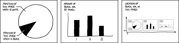
This series of graphs from Randall Munroe's xkcd is entirely self-descriptive. As the mouseover text on the original image says: "The contents of any one panel are dependent on the contents of every panel including itself. The graph of panel dependencies is complete and bidirectional, and each node has a loop." That is, if you decide that you want to change the size of the black pie slice in the first panel, you then have to change the height of the first bar in the second panel (which changes the height of the second bar), and then change sub-panels 1, 2, and 3 in the third panel (indefinitely changing the sub-sub-sub-etc. third panel). What I love about this is how it's such a complex intra-active system without relating any useful information to the viewer. The workings of this map (or comic, or graph, or drawing) are entirely internal.

What makes this funny to me is how Munroe uses the traditional language of visual information (i.e. maps , charts, graphs) to present something inward-looking, and really, pretty useless. It's not a wolf in sheep's clothing -- it's existentialism in sheep's clothing (interesting to think about, very abstract, and not at all directly relevant to your life). But he's not trying to trick the viewer into thinking that it's anything more than that. A cursory glance may make you think there's something more going on here, but read the text and you'll see that all the things this map refers to are located within the map itself.

The great-great-great-ancestor of this map could be Magritte's "The Treachery of Images."

It's not a pipe, but it looks like one. The original image is a painting of a pipe, which you can't smoke with. Similarly, Randall Munroe's map is not a map -- it's a map of a map. Or does that make it a map? You can make a map of a thing, but you can't make a pipe of a thing (apples notwithstanding). Maps, drawings, paintings, charts, and graphs are all forms of visual representation, and yet visual objects themselves, which makes it tricky to deal with when an object visually represents itself.

I forgot what I was talking about!

Posted by Scott

Evolution of Nokia phones

I thought this was kind of a cool visual representation of how a certain kind of technology has evolved over time.

Not that clever as far as maps go, I suppose, but still interesting.

Posted by Dave

November 9, 2010

Where are the Minneapolis maps?


I found this great data visualization and map in Wired about the calls made to 311 in New York (You can read the whole article here).

But then I realized that so many of the classes we've shared for this class revolved around New York and I thought: where's the love for the Twin Cities?

I couldn't find much, except my this map of Minneapolis that my friend Andy converted into a board to play the Minneapolis version of Risk.


I guess it's up to us. Let's find some cool ways to represent the awesomeness in the Twin Cities.

posted by Molly

November 7, 2010

Maps and type


Given the dual nature of this blog, I thought this map would be particularly interesting. There are some better pictures on some of the credit links.

(Brought to you by Axis Maps through Infosthetics through Fast Co. Design through Gizmodo.]

--Posted by Marin

November 4, 2010

Typography in Motion


This is a really great video. It reminded me of our first project, handmade typography, but in motion!


Posted by Tim

Sculpture- Steel Letters


Mark Andrew Webber - paris map- Linocut


November 3, 2010

Get your own map!

Today one of our classmates mentioned he might be willing to be a guinea pig for my map project that explores the relationship between emotional closeness and geographic distance. If you are interested in this, what I'd ask you to do is list up to 300 people you know with their city and state (or zip code), pick why you know them from 5 categories (work, family, K-12, college/grad school, other), and assign them a "closeness ranking" from 1 to 7. I've created a Google spreadsheet here where you can enter data. If any of this doesn't make sense, I've got answers and you can email me here. --Posted by Marin

An Early GPS

Posted by Lisa

maps bring meaning to election results

The NY Times had some great maps that helped to make sense of last night's election results:

http://www.nytimes.com/interactive/2010/11/03/us/politics/election-results-house-shift.html?ref=politics

posted by Molly

The Seven Bridges of Königsberg

In the city of Königsberg, Germany, there is a part of the city surrounded by a river, which flows away in three directions. There are seven bridges in the city. Here, use this image as a reference:


Euler, a mathematician, posed the following problem: is it possible to navigate a path through the city crossing each of these bridges once and only once? Assume you're not allowed to cross the river unless it is via one of the bridges above. Spoiler: you can't do it. There's a proof of why that I used to know several years ago, as a young man growing up on the mean streets of Milwaukee, but those days are over. Now I'm more interested in this problem's taking a very geographically-based network and removing it from geography.


This is the same map as above, only with all geographic references taken out. You can't see your house from here, but you sure can try to find a path across the bridges. Here the yellow dots represent regions of the city, and the lines connecting the dots represent paths across bridges. I'm interested in doing something similar on a large scale, say, the US Interstate System. We'll talk in class! I'll probably repeat exactly what I say here because we're just going to look at the pictures! Excellent!

Posted by Scott.

Ford Foundation grant map

One example of a foundation showing their grants in a map view.

I'm interested in presenting the same data but in a more engaging, interesting way.

Posted by Dave

Making Blogs a Better Place


Typographer Jessica Hische is out to make blogs a more beautiful place. In addition to her personal blog, Hische has the Daily Drop Cap, a blog that features a new handcrafted, capital, initial cap each (working) day of the week. Hische, in addition to manufacturing her own beautiful, full-fledged typefaces, commits to creating these caps daily for "the beautification of blog posts everywhere."

It's worth checking out, and I would recommend looking at her full typeface sets on her personal blog as well.

Posted by Caryn


Timelines of Time Travel


I was trying to figure out how to deal with timelines, and I came across David McCandless. He refers to himself as an information designer and has a great blog entitled Information is Beautiful.

I enjoyed his take on time-travel in movies, which is shown on the left. This one captures method of time travel through the color of each curved line, which is labeled with the film or tv show that took that trip through time. He also labels as paradoxes the interesting relationships between the time travels in each movie/film. He has created a similar timeline for Doctor Who.

Check out David at his TED talk about turning complex data sets into visualizations. He also has an interactive display entitled Snake Oil? that is worth a look.

Another visualization by David McCandless is his graph of peak break-up times based on facebook status data, which I thought had some amusing observations.


Posted by Sylvia

Map: Flavor


Mapping flavor-- or also known as a Carbon Foodprint.

The flavors of food are not unique per product--it is the right combination of flavor molecules that make each product have its particular taste. That means, each product can be easily replaced by a combination of other items.

This chart shows the flavor of an orange.

There are ten key flavors to combine that are needed to recreate the orange flavor. Each color in the chart represents a key component with its flavor named per category- i.e. herbaceous woody, green, floral citrus, etc.

To obtain the flavor of an orange, you must take one component from each color category. The length of the line in the graph represents the amount of that flavor. The longer the line, the more you will need.

Posted by Anne Ulku

Various Type and [gasp] a Map.

A few things I've found this week:

Swedish designer Hampus Jageland has created spice packaging that uses clearly defined grid characteristics and interesting-but very slight-variations in typography. What's surprising about all this is that the packaging is intended for the visually impaired.


Irina Vinnik's sketchbook work deals explicitly with typography at times, but also with form and shape that still carries a very letterform-like feel.


Lastly, and it solidarity with Cartography, the unholy union of TYPOGRAPHY & MAP:


Posted by Jordan

November 2, 2010

Three random-ish map things

First, I'm not sure this counts as a map per se, but it's cool, and related to scale, which is a mapping-ish thing (you have to follow the link, it's not a picture):


I like it because it's kind of a "Powers of 10," but interactive.

Second, while exploring what turned out to be a dead end for my class project, I found this amusing set of tools, which includes a midpoint calculator, a bearing/distance calculator, and a random geographic point generator (which I want to figure out a use for somehow, someday): http://www.geomidpoint.com/

And finally, for Lisa in particular, this is kind of the inverse of your map project (from the Strange Maps blog again):


--posted by Marin

October 31, 2010

Directions

Here is the map I kept promising to show Neal in class last week but then kept forgetting. It is what inspired my project idea of movie settings v. filming locations. The map shows all the locations in CA that stand in for different locations during movie filming.


But then today I was walking through the Mall of America to find some pants and I saw this ad for a fancy shaving shop called "The Art of Shaving." If I had needed a shave, I probably would have gone in, but I didn't. Anyway, the map inspired a very new direction that I think I like much better than the old. So we'll see how it goes.


Posted by Lisa.

October 28, 2010

I'm a believer

The Believer is my favoritest magazine. The covers are designed by David Eggers (author of A Heartbreaking Work of Staggering Genius) using illustrations by Charles Burns! There are no ads; just original content about literature, the arts, and ideas. Everything is set in Clarendon and printed on hearty paper rather than a glossy, thin paperlike product. It's lovely to hold, view, and peruse.

meister josh

Avant Garde spread


Because I'm mildly obsessed now, here is the cover and an inside spread from Avant Garde magazine.


Posted by Tim

October 27, 2010

Map of Cannibalism - a traditional example

Here's a traditional example of a geographic map, which represents the global spread of cannibalism. I'm posting it as it may end up relating to my topic.

This map, from the German/Austrian publisher A. Hartleben, dating from the early 20th century by the look of it, presents a map of the range of anthropophagy, both contemporary (in red) and historical (in yellow).


A more up-to-date map would have to include Armin Meiwes, the German internet cannibal.

Posted by Sylvia

100 years of music using London Underground map

The challenge: chart the branches and connections of 100 years of music using the London Underground map.

The result:

The full map (PDF) is linked in Going Underground blog from the Guardian's Culture Vulture.

Posted by Sylvia

The Family Tree

Which came first, the idea of displaying genealogy as linking familial relations from top to bottom chronologically, or the term 'family tree'?
Here's a pretty typical family tree, comprising what looks to be around 9 generations. The farthest back in history is at the top-most part of the 'tree,' and the most recent at the bottom. Weirdly, this is completely inverse from how trees actually grow (you know, from the ground up), but the analogy has stuck so well that it's very easy to find 'family trees' that are stylized to resemble physical trees.

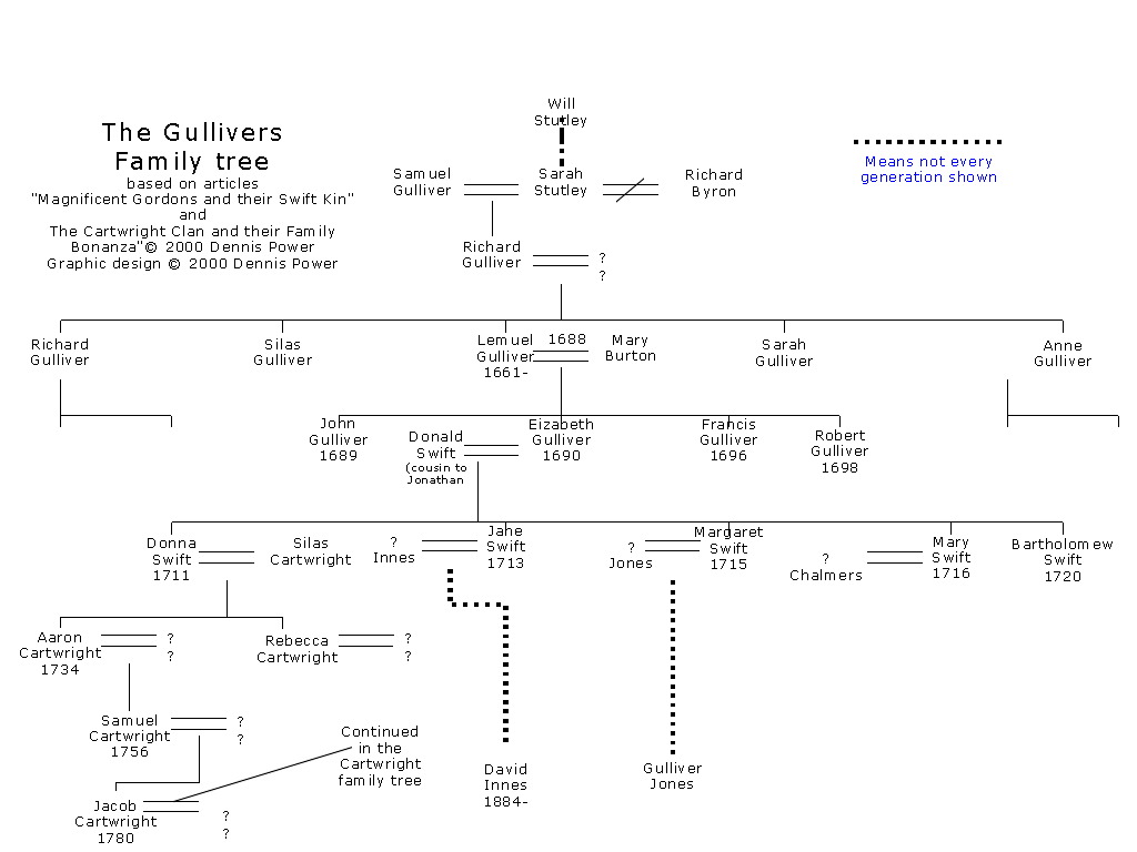
This one's a pretty lazy example, with the 'family tree' being superimposed onto an illustration of a tree. Poor Scotty must have been kicked out of the family or something.

This one's great for a number of reasons. The entities represented are actually connected via branches that wind around each other to signify familial relations, and the creator realized the backward nature of the 'family tree,' choosing to instead build it from the ground up. You can see Donald Duck in the second row from the top (second-to-youngest generation), third from the left. There's a nice depiction of different families that Donald's lineage stems from by means of separate trees, the branches of which get jumbled together. In addition, the fact that we skip a few generations going from Pintail Duck (bottom, middle tree) to Humperdinck Duck is shown by the branch momentarily disappearing behind leaves: that chapter of history is obscured to us.

Family trees are a way of tracking relations between members of one or many families, but once you go enough generations back, or enough cousins sideways, it becomes increasingly difficult to accurately, visually portray the information. For instance, it's likely (though I'm sure you don't want to hear it), that your biological parents (or you and your partner), have a common ancestor within written history. Super-likely if you and your partner have the same ethnic and cultural background. For the family tree, this means that a 'branch' would split (via children, grandchildren, etc.) and eventually rejoin. Visually, this would mean 'branches' crossing over each other.

Is it possible to create an organized family tree that includes dozens of generations and thousands of people, given the super-prevalence of incest?

Is a tree the best visual metaphor we can come up with?

How would a family tree of families be depicted visually? That is, instead of representing individuals, representing families (and how do you begin to define that?)

Posted by Scott.

Magazine Spreads & Etc.

First, a few interesting magazine-layout-related articles I've found:

The Creative Design Blog has a short article about an early 2010 Ikea ad that-while keeping text to a minimum-does some interesting things with an underlying grid-like structure across the spread:


The IDSGN Blog details a lecture given by Jason Santa Maria (a video is available at the bottom of the page) about applying magazine spread design sensibilities to the web:


If you're looking for some good inspiration for your spreads, check out this page on Best Design Options.

Lastly (and kinda unrelated), The Economist has an article about how the letterpress and its mechanical aesthetics have been (partly) misapplied in the digital age: Letterpress Revived.

Posted by Jordan

October 26, 2010

Scott McCloud, Linux, and e. coli


Scott's Chris Ware post from last week got me thinking about comics as maps. I was reminded of the work of Scott McCloud, a graphic novelist in his own right, but better known for his critical, academic writings about the medium of comics. The "map" (I suppose technically it is more of a chart, but that's a kind of map, right?) at left moves from abstraction to representation along the vertical axis and from drawings to words along the horizontal. Taken together, it is a pretty awesome representation of the vocabulary, grammar, and meaning available not just to comics artists, but to any visual artist.

The second map compares the Linux OS with e. coli bacteria. I don't fully understand this, but I think it is fascinating.


Both of these maps came from http://blog.visualmotive.com/

Posted by Dave

October 25, 2010

Map: Marian Bantjes' Influences

Marian Bantjes- an elite artist, designer, typographer, illustrator and writer- has mapped out her obsessions, travels, personal artistic influences, themes, working materials, styles of work, etc. A visual representation, and work of art, that truly represents who she is as an individual. (Map dated from August 2006)


See it on her website: Influence Map

Posted by Anne Ulku

Populations as 3D Spikes


Two maps that represent populations as 3D spikes. Pleasing to the eye, no?


Posted by Lisa.

Minimal Text Spreads


When browsing magazine spreads, I find myself preferring the minimal designs. I like the effect of a two page spread with a minimal amount of text within a text dominated magazine.

Posted by Caryn