September 29, 2009

Design: Think


"Focus less on the object." And more on the idea.

Tim Brown's TED Talk on Design Thinking re-imagines designers' roles in society. Traditional design wraps the object to make it more aesthetically appealing or enhances (tweaks) its shape to make it slightly more functional.

Brown, however, urges designers - and businesspeople - instead to apply design thinking: to collaborate (designers, psychologists, marketers, engineers, etc.) on all levels to create innovative solutions. Find out what the need is in the marketplace and make something to fill that need.

As graphic designers, we are trained to be visual problem-solvers. What stops us from solving larger, abstract problems? If we can communicate abstract ideas such as "unity" or "compassion" in a visual metaphor, why can't we work with engineers to create better transportation systems (for example)? We must understand our audience as graphic designers, and as people trying to communicate a message we should make sure what we're saying to that audience has the right impact. That's where design thinking comes in.

You can also read the article about design thinking, by Tim Brown (Harvard Business Review, June 2008). It's fascinating as well, and reviews case studies of design thinking/innovation.

(Post by E. Noelle)

September 26, 2009


The chalk outline is comprised of the ipod earbud cord, and the end of the cord seems a little reminiscent of blood draining out on the street. These are for a public service campaign to pay attention when you cross the street.

For others go here:

posted by Tony C


Logo


[Posted by Sergio]

I was at this place the other day looking for floor tile, but the arrow in the logo also creates the overhang on the house.

posted by Tony C.


September 25, 2009

It's a common logo, but I never saw the smiley face in the Goodwill logo until I read about it this week. I only ever saw the letter g in the logo before.

Posted by Sylvia.


I really like this logo, it's very simple, clean and clear. I think it's a decent example of gestalt, a New York City building made of books. Also, there are a lot of things to consider when creating a logo for a publishing company, it's important for it to be unique, but it also has to fit on the spine of a book and be clear and recognizable. I think this logo achieves that.
-Michaela

Creative Logo


I liked the Gestalt factor of this image. Also, considering their business is sharing wine with friends, having both the t's shaped as bottles may trigger a "buy one, share one" mindset.
Elise

Another logo


A nice simple logo for Flamerite Zippo Lighters

posted Scott F.


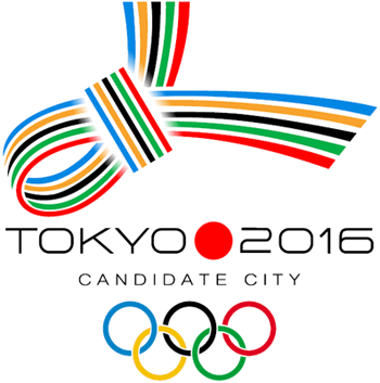
I wanted to post this logo to compare it to the London 2012 logo that we critiqued in class. I think it conveys multiculturalism with the band of colors coming together to form a knot. I also like how the it combines elements of Japanese culture such as sleek minimal design and the red circle from the Japanese flag.

I like the way this logo conveys the message of fun and happiness. This logo clearly links an image to the organizations purpose or mission. It coveys emotion without becoming overly busy or complex. posted by Lawrence.

September 24, 2009

Brand with Caution (Logo post)


The designer who created this logo for the Catholic Church’s Archdiocesan Youth Commission (in 1973) must have thought he/she was very clever. Why, this logo is award-winning! It has such great Gestalt! It symbolizes the loving & paternal relationship priests have with their pupils!

Then it all hit the fan. Turns out this designer was more savvy about the "loving" relationship than he/she knew.

It's a good place to start thinking about how logos' meanings can change as the brand itself changes - think about Enron, etc.

(Post by E. Noelle)

September 23, 2009

Logo Post (just for fun)

Here's another logo that I found and I thought I should share:


• posted by Greg

Logo Post 2


This is the logo for Surly Brewing Co. The Brooklyn Center based brewery has been around since 2005 and has recently had a surge in popularity. Their beers are good, but I think some of that success can be attributed to their overall brand identity, which includes this logo. The firm Bidwell ID is responsible for the branding and design.

In class we talked about the "bad" logos and how some of them don't showcase what the product actually is. I think this Surly logo does the exact opposite. You can definitely tell that it's for a beverage company, specifically brewery is stated in the logo. I like the play of the logo being able to be flipped in either direction (upside down/downside up). It's very balanced and the thick black lines help to create the man's head and beer class in an almost negative space where it's stylized but not abstracted being recognition.

• posted by Greg

September 19, 2009

City of Melbourne System


More detail on the new Melbourne system here.

September 18, 2009

Logo Design

I chose one clever logo and one simple but effective logo.


Posted by: Sergio
I saw the post with the Sun MicroSystems logo and wondered if it is an ambigram? I read about images that can be looked at from different directions and still spell out the same word. A famous one is the Aerosmith logo design by David Langdon. -Lawrence
http://www.jon-hester.com/wp-content/uploads/2009/06/timefog-logo.gifhttp://www.jon-hester.com/wp-content/uploads/2009/06/timefog-small-logotype.jpg

This logo comes from a local record label. I like the simplicity and playfulness of the design.

Posted by: Margot
This logo grabbed my attention as I was searching. It is tied to Sun Microsystems... so it may be somewhat recognizable. Up until now I hadn't looked very closely at it. It appeared before now to be just four interlocking versions of the word "sun," but now I notice how each letter is formed by variations of the letter "u." My thought is that considering Sun (as the techies in the group may know) utilizes the Unix O/S, that the "U" is tied to Unix. If so, then Sun has a logo that really speaks to who they are as a business... pretty clever.

Elise

Logo

This image has both the old and newly revised logo for the Chicago 2016 Olympic campaign. I like the first design because it brings to mind the Olympic torch, and for anyone familiar with the Chicago skyline, it is outlined in the flames, and the blue reminds me of Lake Michigan. The second one is also nice (apparently there are stars on the Chicago flag) I also really like the colors and the type choice for both.

Posted by: Michaela K

September 17, 2009

Logo websites for reference

Enjoy! (Posted by Neal)


Also—Word to the wise: Always show great care when
choosing a typeface for your logo:


Logos


Take a peek at these for your upcoming first project:
(Posted by Neal)


Logo


I like this logo for its simplicity and use of negative space. The company does home maintenance, and the logo communicates those two ideas ("home" and "maintenance") very clearly. More detail here.

Posted by Jon

Logo


I thought this was a great logo showing closure. It is for Tall Tales a restaurant in Gander Mountain. Within the antlers there is a fish and a duck.

posted by Scott F.

Logo post


Just came across this logo today and immediately it jumped at me. I think it's very creative. The shape that is immediately recognizable is a tree with a swing on it, but upon closer inspection the shape of the tree is the shape of the African continent. The simple use of color would make it good for variety of purposes (web, print, etc...). The typeface is interesting, evoking a primitive feeling without being over-the-top.

The logo was made by a UK design firm askSanik for the charity group East African Playgrounds.

• posted by Greg

This is a sample of a logo done by a marketing firm here in Minneapolis. This company, Rubio Image, caters to executives. Some background given on this work: Rubio means blonde in Spanish. The two yellow dots represent a mirror image. I like this logo. I think the letter R becomes both objective and subjective. We can easily recognize it as a letter of the alphabet, but can also see it as an abstract shadow projecting from the man. The yellow dots under "i" letters (instead of over) is very clever. The placement and proportion is interesting. The man stands taller than the letter next to him, but the R is wide (nice balance.) In regards to movement and direction, I find myself drawn to the man's yellow tie first and then follow the image as it connects to the letter R. (posted by Lawrence)

Negative Space


Negative Space Illustrations by Noma Bar

These are not logos, but they do make very clever use of negative space.

Check it out here.

posted by Tony C.

September 14, 2009

Housing Works Logo by Number 17


Great logo design by Number 17 for the Housing Works Bookstore & Cafe. The logo curves like an open book, reading instantly (no pun intended) that it is related to literature. In addition, for the Housing Works name they use a sans serif typeface, which reads quickly while the smaller "bookstore" and "cafe" with the serif typeface give a feel of older/traditional printed work.

(Post by E. Noelle)

September 13, 2009

New Castle Food & Wine Festival Logo-Jacob Cass


I found this logo in the portfolio of an Australian graphic designer. I thought this logo for a food and wine festival uses great economy. In class, Neal said that a logo should be quick, effective, and simple. The way this designer, Jacob Cass, used the negative space to create smaller wine bottles inside a larger one really caught my eye. There is a simple elegance to the design that appears to evoke feelings of style and sophistication much like a high quality vintage might. The type balances itself with the image quite well. I also like the way the designer highlighted the words "FOOD & WINE" in yellow. Posted by Lawrence.

September 12, 2009

Welcome to Fall 2009 - Graphic Design 1.


Hello.


Posted by Neal.

Gestalt Principles

http://www.andyrutledge.com/gestalt-principles-1-figure-ground-relationship.php

I found this blog entry and since you mentioned Gestalt in class today, I thought I'd share with everyone. It's a very in-depth essay series (5 total) about the various aspects of Gestalt theory. Definitely worth the read, and he uses a lot of examples especially for web based design.

Posted by Greg