November 16, 2009

See ya

So sorry for missing last class, I worked all night Friday and went to bed at 4:00 so I just didn't manage to wake up. Anyway, I always wanted to share something just for fun for those of you who are into and/or appreciate production stuff. This one is pretty fun. Thanks for the good term, see ya.

Neurosonics Audiomedical Labs Inc. from Chris Cairns on Vimeo.


[Posted by Sergio]

Goodnight and good luck.

Thanks for another great term! We will return next spring beginning early February.

Cheers,
Neal Peterson

November 12, 2009

Dressing Down


I was thinking today about the fact that generic brands tend to do better in hard economic times, and wondering about the consumer mindset while purchasing them. Does more complicated or "nicer" looking design always equate to a higher price? Does generic (generally sparser, simpler design) equate to better value? And where does quality enter into the picture? (You can read a good article on this here.)

We need to think about the consumer in all of our designs, as we are designing for an audience. Though we may be thinking of the latter, however, does not mean we'll always be on target. Take, for example, the Tropicana rebrand (now reverted back to the original design). The new design pushed a modern, clean feel of the juice to broaden its audience and gain share. To a lot of people, the new package looked like a generic, which did the reverse of differentiating the brand. If there hadn't been such a backlash to the new design - from customers fiercely loyal to the old brand - perhaps we'd see how the generic-looking new model would be doing more long-term in midst of the recession.

Just something to think about while browsing the supermarket.

(Post by E. Noelle)

November 7, 2009

Websites per classroom conversation...


Posted by Neal.

Designers Work to Rescue a Dying Art Form -- the Album Cover

Some ideas on where album art is headed in the digital age.

http://www.wired.com/entertainment/music/commentary/listeningpost/2007/03/listeningpost_0402

post by Scott

Memorable cd art


Whenever I think of cd art, I always get taken back to the day that I bought Radiohead's Kid A. Opening the case and flipping through the booklet, I remember thinking this is kind of cool, but weird at the same time. Referencing there previous albums' (Ok Computer, The Bends) sounds in my head, I was perplexed about how this art fit with their music. Then listening to the accompanying cd, it clicked. I think Kid A, at that time, was a new direction for Radiohead and the cd art was the first thing that showcased that. The geometric planes, cold colors, solid yet haunting feelings expressed by the cd art were also found in the music of the cd. Years later, I still love that cd, and have come to love the art that came in association with it. I guess it's just something to think about...is the cd art going to make as much of an impact as the music? Is it supposed to?


• posted by Greg


November 6, 2009

Print is Dead


"Print is Dead" ... this title, the hand-drawn look of the type all made me take notice. This cd was designed for a band named "Yourcodenameis:Milo." The typeface looks hand-drawn on the paper insert found inside the jewel case... very minimalistic. You can see images of the back cover and cd contents on this page: http://sleevage.com/yourcodenameismilo-print-is-dead/. Those images help convey the idea that everything on this cd was handrawn and not printed, which makes the title all the more real.
Elise

A few classic album covers...


Notice the Andy Warhol design for the Velvet Underground and the use of cooper black (typeface) on the Beach Boys album cover. Posted by Neal.

November 5, 2009

The Bad Plus Cover Art


Every since I started listening to The Bad Plus I've enjoyed their covers as much as their music.
[Posted by Sergio]

November 4, 2009

Les Savy Fav - 3/5

I think this album cover illustrates the influence of hierarchy on an album cover very well. Were there not a sticker that says "Les Savy Fav - 3/5" you might think the "Shower Caps" had just released an album called "Bonus Pack."

That's not to say, however, that this is a "bad" cover. I think the layout choice fits the tone and themes of the music within, making it an effective piece of the album.


[Posted by Jon]

Urban Cursor


Not totally related to design, but Urban Cursor is eerily close to the concept I used for my poster and I thought it might be of interest. Found it here. Enjoy...

[Posted by Jon]

November 2, 2009

CD cover


Mott the Hoople were an English rock band well known for being a part of the popular glam rock scene of the mid-70's. The lead singer/songwriter, Ian Hunter, continued on for many years as a solo artist. The record company asked for an illustrated solution, and because Ian's hair and glasses are so iconic, that's where we started. This 2-CD set features Mott the Hoople's notorious hit, "All the Young Dudes" written by their fan and friend, David Bowie - which was also featured in the soundtrack of "Juno"

Posted by Scott

"BRL
SQOTHEQUE is the music-related division of Burlesque of North America. Since 2003, the Minneapolis-based Burlesque has been designing and screenprinting concert posters for Arcade Fire, Mad Decent, Stones Throw, and MGMT, creating artwork for Nike, T&A Records, and Mass Appeal Magazine, organizing the annual Dre Day parties in Minneapolis and New York, and exhibiting the artwork of their peers in their own First Amendment gallery."

check it out in this place

posted by Tony


November 1, 2009

Art is Music is Art


Some inspiration for great album covers paired with great music - check out this post on Music is Art about the best album art of 2008. Like this one, for The Notwist.

(Post by E. Noelle)

October 31, 2009

A poster designer from the past

I'm currently reading The History of Graphic Design by Philip Meggs and have just come across a cool poster designer of note. His name is A M Cassandre and he's done a lot of very cool posters. He's particularly famous for posters of European rail and cruise lines. If you'd like to know more, here's his Wiki entry: A M Cassandre

And some examples of his work:


• posted by Greg

October 30, 2009

But does it work?


Similar to posters, billboards must intrigue viewers and communicate a message. Billboards, however, have far less time to do so, as viewers pass by at 60+ mph.

Interesting, quirky billboards will definitely grab commuters' attention, but is it good design? An article about this clever billboard makes a good point - will you actually remember that this ad is for toothpaste? Or just that it's a fun idea?

It's a good reminder that designers should constantly be thinking about the efficacy of their message - and not how cool it will look on the way to work.

(Post by E. Noelle)

October 27, 2009

The importance of hierarchy in graphic design...


Posted by Neal.

October 24, 2009

Hand made type poster...


Image from http://www.jvallee.com. Awesome work. Posted by Neal.

Poster Exhibition


For the last two years I have attended an exhibition back home about poster design. This is the website of last year's participants: http://www.bienalcartel.org.mx/seleccionados.htm

This one was my favorite in 2006. It received Mention Distinction. It was designed by Anne Giangiulio, an assistant professor of graphic design at the University of Texas El Paso.

[Posted by Sergio]

October 23, 2009

Rock Concerts


Poster art lives strong among rock concert promoters and artists. I stumbled upon some recent concert posters at this site, http://www.posterdistrict.com/?cat=9, including this interesting one from the Pearl Jam's August Chicago show. The creature kind of reminds me of Chicago's Science Museum old heart exhibit.
- Elise M.

October 22, 2009

Posters

Thinking about posters always makes me think of this guy, Jason Munn. He runs a screen printing poster shop, The Small Stakes. I've got a couple of his posters and his clean sense of design and immaculate printing skills are completely enviable. Plus he gets to design posters for cool bands all the time, what's not to envy about that?

Here's his site: The Small Stakes

And a couple examples of his work to pique your interest:


October 21, 2009

Mono-licious

Just checking out design/branding/ad agency mono's work - look at their non-traditional work; it's cool to see how they creatively communicate their clients' messages (with beautiful design work as well).

(The image won't load because it's a flash player, but click, I promise it's good!)

(Post by E. Noelle)

October 20, 2009


I really liked the imagery of this poster. I think it makes a very bold statement. Inspirational for our upcoming poster design.

posted by Scott.

October 19, 2009


The London Olympic event pictograms have been released, and since we have been discussing their logo, these seem relevant. I thought it was interesting that they had a high contrast version of each for navigation, and a "london underground map" inspired version for publications.

Check it out!

-Tony C

October 17, 2009

Interesting idea about color

I know color was a couple of weeks ago, but I posted about type, so now I'm going to post about color. Here's an interesting exercise to get us thinking about colors differently.


Every day for one hundred days (from October 30, 2008 to February 6, 2009) I picked a paint chip out of a bag and responded to it with a short writing. I have selected my favorite forty, titling each writing with the number of the day it was written (out of 100) and the name of the color from that day’s paint chip. This project was generated in Michael Bierut’s 100 Day Workshop at the Yale School of Art. ...

• posted by Greg

October 16, 2009

What Are We Saying?


This is an interesting article which looks at both sides of a visual message, though this time this is breaking down "design for a cause".

It puts out the question: what are we saying that we're not intending to say? Visual communication is powerful, and we have to remember that our work - personal or for clients - has an impact beyond the demographic we're targeting (and perhaps within it as well).

Sometimes we need to step back and think about what we're doing, even if we do it - as this article points out - with good intentions.

(Posted by E. Noelle)

Type Radio

For those more interested in hearing about fonts/typefaces than reading about them, then Type Radio may be for you. There most recent segment (9/16/09) is on Robert Meek who's with Fontstruct, a font creation online site.

Elise

Creative Characters & Rising Stars

I stumbled upon this site, http://new.myfonts.com/newsletters, where every month they feature a font creator in their Creative Characters newsletter... for type diehards this is like the old VH1 "Behind the Music" segments except on fonts. Font creators both dead and alive are highlighted, including gill sans creator Eric Gill who was said to be "...a man in love with letters and life." That's deep.

The site's Rising Star section highlights different fonts, which is fun to look through. I liked the elegant look of the Mussica font in this month's (October 2009) issue.

Elise M.
Here are a few good blogs/websites for design and typography that I find interesting, I hope you do to:

http://www.typography.com/home/index.php?affiliateID=
http://www.typotheque.com/site/index.php
http://www.gestalten.com/


-Michaela

Type is Art

Some of you have probably seen this before, but I remembered I saw this website some time ago. It is a "public interactive project" where you can play with different elements of typography. You can also save your designs and see what others have done in the gallery.

Check it here: Type is Art

[Posted by Sergio]

October 13, 2009

Why I like UPS....


Posted by Neal.

October 10, 2009

Typeface Classification Wheel


I ran across
this set of typeface classification posters. I thought they were interesting but I don't know much about them because I can't read French.

[Posted by Jon]

October 9, 2009

Naming fonts

Found (and read) this article about the names and naming systems (which are fairly ambiguous) used for type faces. I remember there was a brief tangent in class a while back about Aksidenz-Grotesk and I think this article shed some light about how some names as such came to be. Interesting read for typophiles.

"Antique Gothic Grotesque: Deciphering the Typeface Name Game

The vocabulary of type is mysterious at best, and nowhere is this more true than in how typefaces are labeled. Yet knowing how typefaces are named and categorized has very practical benefits. ..." (Article in full here)

Written by James Felici on October 5, 2009


• posted by Greg

October 6, 2009

Designing Within Constraints

Here is an interesting series of minimalist movie posters from graphic nothing, made with the stipulations that they include:
-a circle
-lowercase text
-1-2 images not from the film

See, rules are good, because they'll push one to creatively solve the problem in a number of different ways. Note especially that the color selections set a definite tone to the movie being promoted.

My favorites are the Star Wars & Annie Hall posters: simple, clear shapes that sift down core themes from the movies. Nice.

(Post by E. Noelle)

October 4, 2009

Applicant City Logos

I found this roundup of Applicant City logos for the 2016 olympics. It's interesting how they all have similar "olympic" color palettes except for Rio. Seeing them all together makes me wonder how much influence (even if only subconscious) these logos really have on the Olympic committee's eventual decision.

[Posted by Jon]

Rio 2016

Apparently the 2016 Olympics will be in Rio. Today was the first time I saw the "candidate city" logo, and it leaves me wondering why the designer chose to do the things they did with color and form. The "heart" shaped icon is a confusing choice, and it's placement makes the entire mark feel unstable to me. The color choices in the icon and the text are also confusing. Are similarly colored type and graphic elements related in some way? Is "16" more important than "2000"?

I thought this was interesting in light of our discussion about the London 2012 logo.

[Posted by Jon]

Color Trends in Logo Design


The Museum of London logo is a trend of 2009. The voalris logo is a trend of 2008. I like how they both make effective use of different colors as well as opacities.
[Posted by Sergio]

October 2, 2009


I thought this was a great use of type as a logo. And it's orange. I'm into orange.

posted Scott F.

Speaking of a redesigned logo...

I thought this was appropriate given our current assignment, also it's kind of funny.
I copied this from a post in the Under Consideration: Brand blog
(http://www.underconsideration.com/brandnew/archives/wisconsin_gets_jiggy_with_acronyms.php)

In Brief BY Armin

Wisconsin Gets Jiggy with Acronyms

Wisconsin Tourism Federation

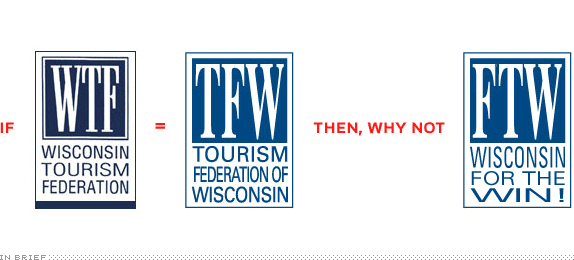
Who would have thought that a web site called Your Logo Makes me Barf would one day influence the identity design of a state-level organization? This past July, when YLMMB added the logo of the Wisconsin Tourism Federation (WTF) to its list of victims — along with the inevitable post title of “WTF Wisconsin?! — the change was set in motion. Yesterday, Milwaukee’s Journal Sentinel reported that WTF had changed its logo to avoid the now infamous acronym of the words “What”, “The,” and “Fuck.” From now on they are to be known as the Tourism Federation of Wisconsin (TFW) with a logo to match. Besides the question of why not fix their visually painful logo while they are at it, I can’t help but point out this missed opportunity: If web lingo has taken you down, embrace it and change it from Wisconsin Tourism Federation to, say, Federation of Tourism of Wisconsin. You know… FTW. For the Win!


• posted by Greg

September 29, 2009

Design: Think


"Focus less on the object." And more on the idea.

Tim Brown's TED Talk on Design Thinking re-imagines designers' roles in society. Traditional design wraps the object to make it more aesthetically appealing or enhances (tweaks) its shape to make it slightly more functional.

Brown, however, urges designers - and businesspeople - instead to apply design thinking: to collaborate (designers, psychologists, marketers, engineers, etc.) on all levels to create innovative solutions. Find out what the need is in the marketplace and make something to fill that need.

As graphic designers, we are trained to be visual problem-solvers. What stops us from solving larger, abstract problems? If we can communicate abstract ideas such as "unity" or "compassion" in a visual metaphor, why can't we work with engineers to create better transportation systems (for example)? We must understand our audience as graphic designers, and as people trying to communicate a message we should make sure what we're saying to that audience has the right impact. That's where design thinking comes in.

You can also read the article about design thinking, by Tim Brown (Harvard Business Review, June 2008). It's fascinating as well, and reviews case studies of design thinking/innovation.

(Post by E. Noelle)

September 26, 2009


The chalk outline is comprised of the ipod earbud cord, and the end of the cord seems a little reminiscent of blood draining out on the street. These are for a public service campaign to pay attention when you cross the street.

For others go here:

posted by Tony C


Logo


[Posted by Sergio]

I was at this place the other day looking for floor tile, but the arrow in the logo also creates the overhang on the house.

posted by Tony C.


September 25, 2009

It's a common logo, but I never saw the smiley face in the Goodwill logo until I read about it this week. I only ever saw the letter g in the logo before.

Posted by Sylvia.


I really like this logo, it's very simple, clean and clear. I think it's a decent example of gestalt, a New York City building made of books. Also, there are a lot of things to consider when creating a logo for a publishing company, it's important for it to be unique, but it also has to fit on the spine of a book and be clear and recognizable. I think this logo achieves that.
-Michaela

Creative Logo


I liked the Gestalt factor of this image. Also, considering their business is sharing wine with friends, having both the t's shaped as bottles may trigger a "buy one, share one" mindset.
Elise

Another logo


A nice simple logo for Flamerite Zippo Lighters

posted Scott F.


I wanted to post this logo to compare it to the London 2012 logo that we critiqued in class. I think it conveys multiculturalism with the band of colors coming together to form a knot. I also like how the it combines elements of Japanese culture such as sleek minimal design and the red circle from the Japanese flag.

I like the way this logo conveys the message of fun and happiness. This logo clearly links an image to the organizations purpose or mission. It coveys emotion without becoming overly busy or complex. posted by Lawrence.

September 24, 2009

Brand with Caution (Logo post)


The designer who created this logo for the Catholic Church’s Archdiocesan Youth Commission (in 1973) must have thought he/she was very clever. Why, this logo is award-winning! It has such great Gestalt! It symbolizes the loving & paternal relationship priests have with their pupils!

Then it all hit the fan. Turns out this designer was more savvy about the "loving" relationship than he/she knew.

It's a good place to start thinking about how logos' meanings can change as the brand itself changes - think about Enron, etc.

(Post by E. Noelle)

September 23, 2009

Logo Post (just for fun)

Here's another logo that I found and I thought I should share:


• posted by Greg

Logo Post 2


This is the logo for Surly Brewing Co. The Brooklyn Center based brewery has been around since 2005 and has recently had a surge in popularity. Their beers are good, but I think some of that success can be attributed to their overall brand identity, which includes this logo. The firm Bidwell ID is responsible for the branding and design.

In class we talked about the "bad" logos and how some of them don't showcase what the product actually is. I think this Surly logo does the exact opposite. You can definitely tell that it's for a beverage company, specifically brewery is stated in the logo. I like the play of the logo being able to be flipped in either direction (upside down/downside up). It's very balanced and the thick black lines help to create the man's head and beer class in an almost negative space where it's stylized but not abstracted being recognition.

• posted by Greg

September 19, 2009

City of Melbourne System


More detail on the new Melbourne system here.